For: Kent State University UX Masters Program
Role: Student, UX Lead
Summer 2020
Summary
During my Information Architecture coursework at Kent State, we were tasked with updating a public library website. We were grouped into teams of four so that we could coordinate research and pool our data for more reliable analysis. The Sharon (Massachusetts) Public Library website currently resembles many other public library sites that have not been modernized due to limited funding, and our goal was the make the site more user friendly through the information architecture of the site, i.e. organization, labeling, search, and navigation.
Skills Applied
- Surveys
- Remote Interviews
- In-person Interviews
- Literature Research
- Classification Schemes
- Site Map Development
- Tree Testing
- First-click Testing
- Wireframing
- Usability Testing
- Peer Collaboration
- Feedback Documentation
- Optimal Workshop
- Information Architecture
Problem
In our hypothetical scenario, the Executive Director for the Sharon Public Library reach out for assistance in updating their site. They had received complaints from users about how difficult it was to find certain things, and site stats like bounce rate and search volume gave evidence to that claim as well.
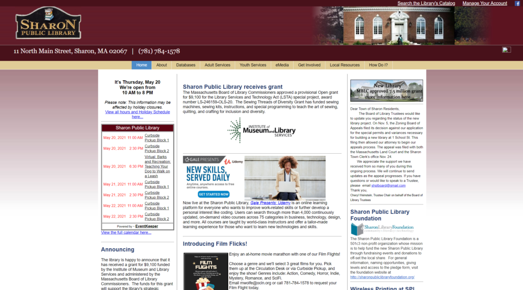
An initial glance at their site gives us a quick understanding of why users are likely struggling:
- Too much information, no white space
- Almost all content is text
- No strategy to content organization
- Poor visual hierarchy
- Chaotic nav organization
A more thorough audit of the site led to a number of other issues that were identified and warranted questioning in our user research.
- Organization – The site was too heavily reliant on secondary navigation menus. Some sections included more than a dozen distinct sub-topics that seemed to have no strategical organizational pattern.
- Scheme – The current site scheme is a blasphemous mix of audience and task-oriented labeling, combined with occasional chronological ordering and inconsistent metaphor-based labels. This organization prohibits users from establishing a usable mental model for engaging with the site.
- Page Title Failures – In reviewing page data via ScreamingFrog it was noted that not a single page on the site contained an SEO recognizable title.
- Accessibility Issues – Most images fail to have alt-text and tab ordering of html code is haphazard.
Approach
Foundational Research
Research Goals
- Understand site usage
- Understand information needs
- Develop a sense of the language used
- Identify common and key tasks
- Understand individual demographic and psychographic factors
Secondary Research - Literature

To ensure I asked the right questions during primary research, I spent some time doing library discovery work through secondary sources, most notably literary research from sources like the American Library Association and Pew. These sources helped to align personal experience with reality before designing survey and interview questions.
Primary Research - Surveys & Interviews
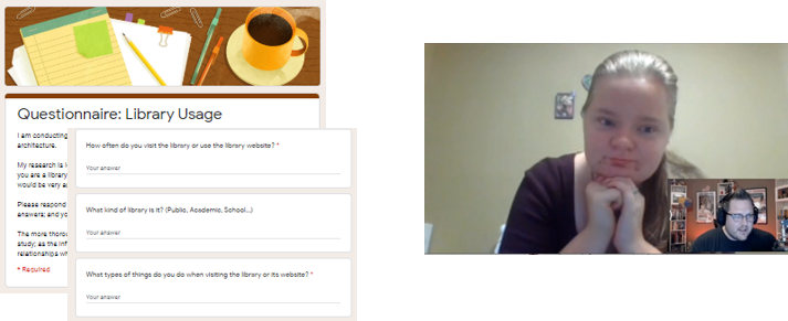
The survey asked participants about their library habits, frequency, access points, information channels, onsite vs virtual usage, and demo/psychographic info to help determine needs for the refreshed site. Each member of our team executed their own research (as directed) but we combined all data to create a more comprehensive view of library patron activities and expectations.
Direct interviews with patrons and library stakeholders themselves allowed for more detailed information collection and real-time follow-up questioning as to motivations and intentions. Library staff spends as much time on the site as patrons do, so getting their input was paramount to the success of the redesign. These, as usual, were transcribed and coded to find similarities between participants, as well as direct quotes that would help sell the changes to the client.
Design - Personas & Tasks
The entirety of the research led to the creation of 4 primary user personas including each’s unique motivations and idiosyncrasies related to library engagement and site usage. The four personas included three patrons and 1 staff member.
Task analysis was then completed to identify common tasks across all personas, to identify our most valuable tasks. Those are the tasks that would get the most attention during site mapping and wireframing.
Information Design
Classification Scheme
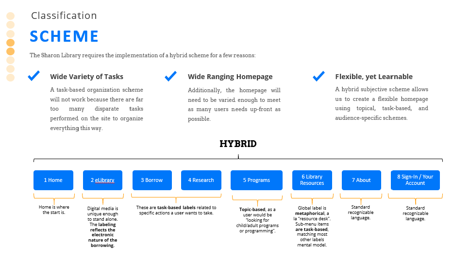
The first step in Information Architecture for a site is deciding the classification scheme to be used. The scheme will set the rules for how users will interpret the organization of the site, whether they realize it not. For the Sharon site, a hybrid scheme seemed like the best option given the variety of information on the site, but the refreshed version would be far more concentrated than what exists today.
The navigation menu included task-based labels like “Borrow” and “Research”, but also Topical labels for programming based on age/cohort. The “Library Resources” category is metaphorically based on users’ prior experience approaching the resource desk for assistance, while sub-menu items are all task-based. This approach is memorable for returning visitors, yet accessible to new users as well.
It met the three key criteria I set out to satisfy from the outset:
- Met a wide variety of task needs
- Allowed for a wider-ranging homepage for fewer clicks
- Created a system that was flexible for admin, but easy to learn for users
Site Mapping
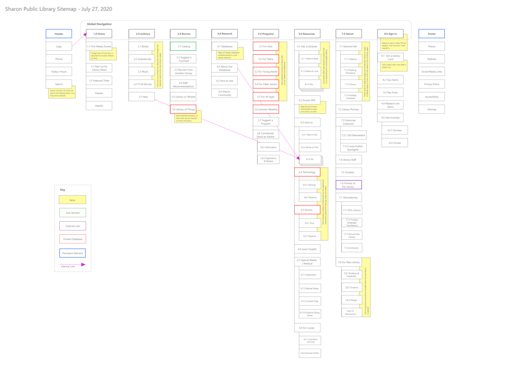
Once the classification scheme has been decided, the next step is building out the entire site map based on its logic. The Sharon site contains a lot of information, but for the library and as a historical record for the town. However, the focus of the sitemap and project is to refresh the website for library users based on our personas core needs, so you see evidence of that in the final design.
Tree Testing
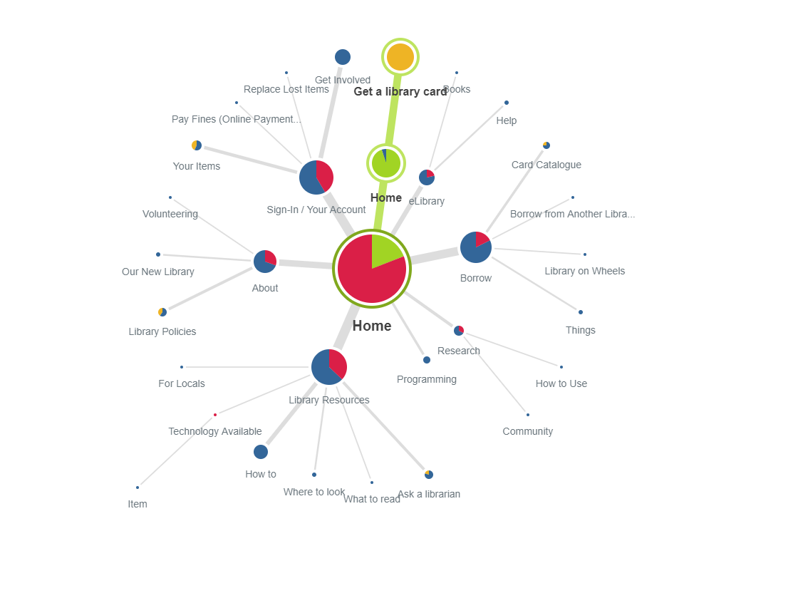
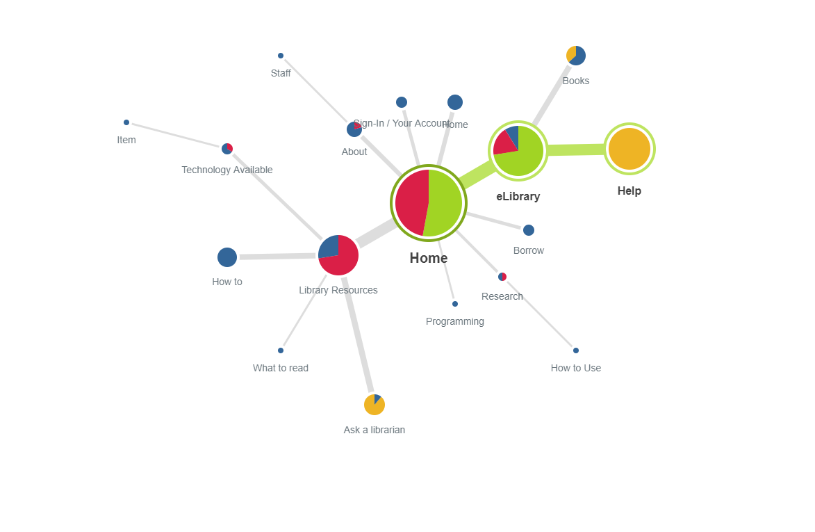
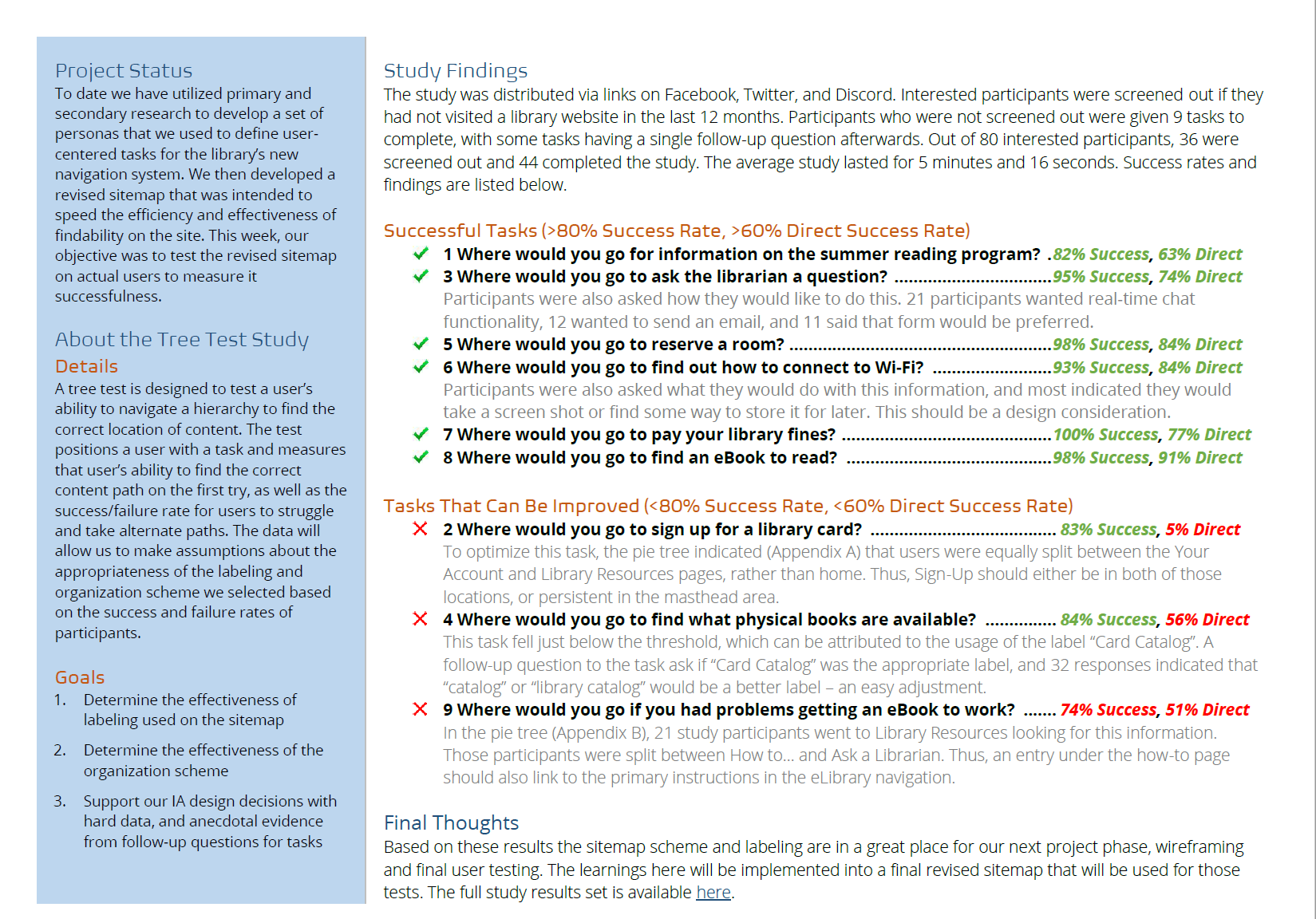
Using Tree Test software from Optimal Workshop, the efficacy of the site map was assessed. The test was administered to 44 participants and yielded strongly positive results with only three tasks that showed a marginal opportunity for improvement. The spider web results indicate where users went to find information and were unsuccessful, and thus need label adjustments and/or content links placed in the navigation.
As you can see in the chart on the left, users had a difficult time finding “where to get a library card”, so that task was cycled back through for additional testing of both naming and organization.
Wireframes
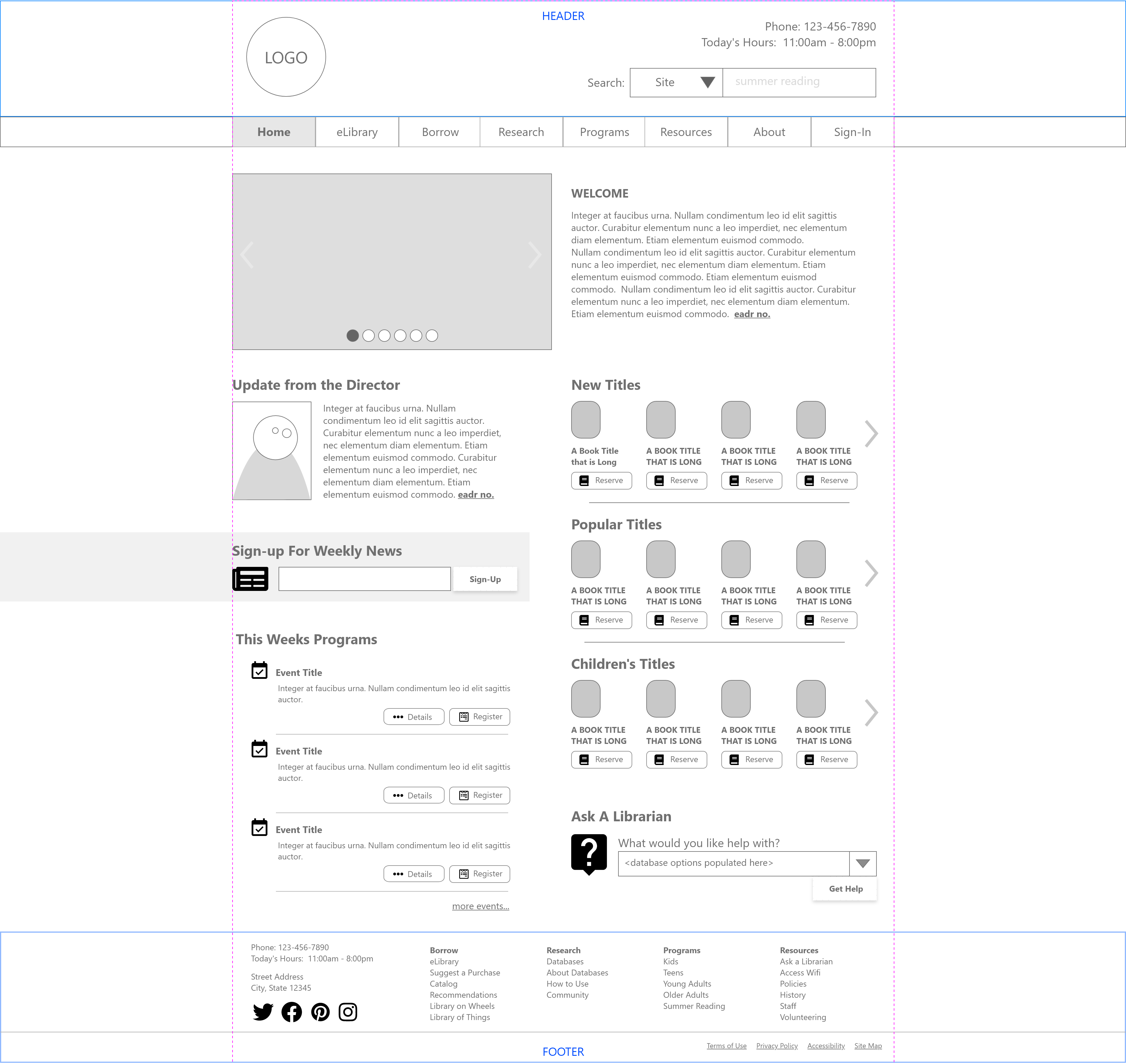
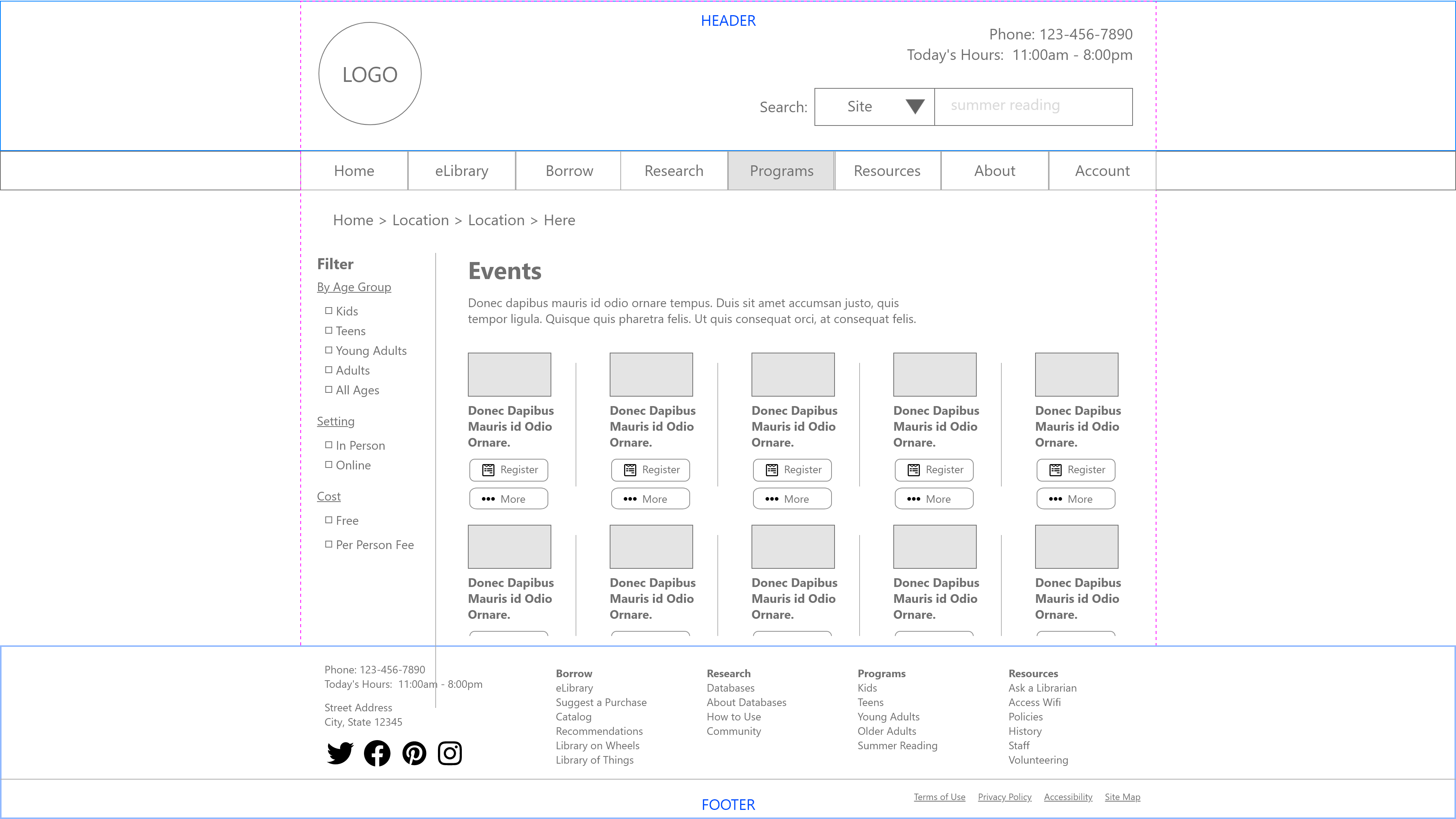
Finally, I put together wireframes using the site map and classifications I developed and tested, focusing especially on two sections.
Header & Footer – Two of the most crucial areas for information finding are the header and footer. Specific wireframes were developed for these areas that encompassed key navigation elements access most frequently.
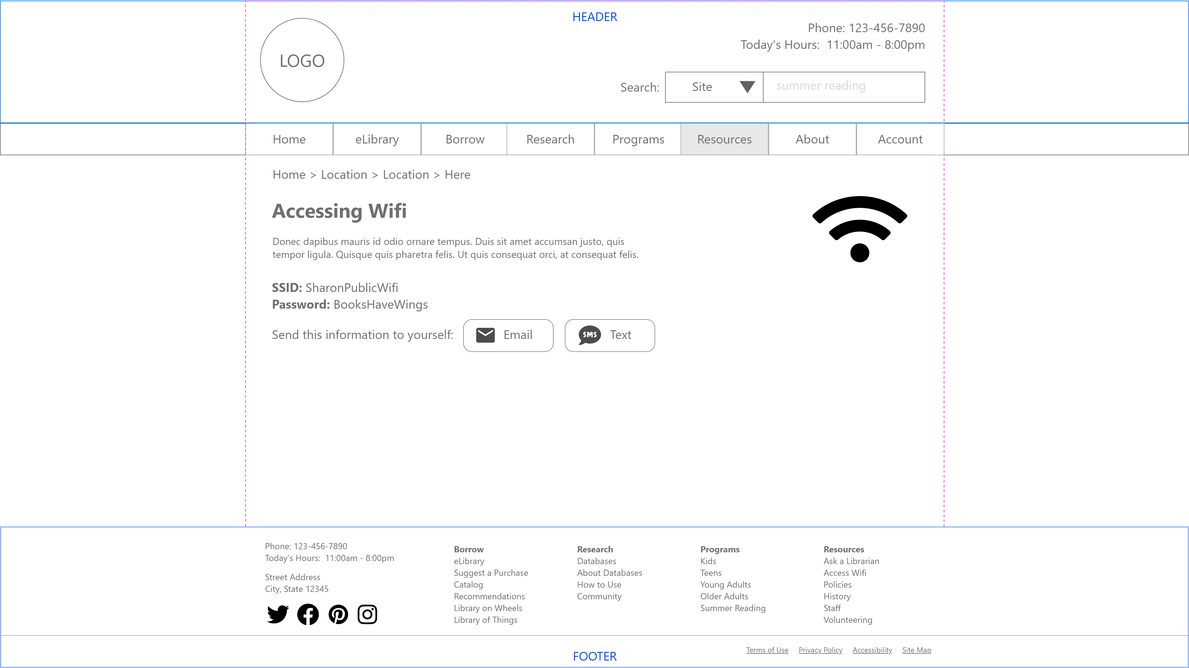
Home – The second most important page of the site is of course the home page. This is where some of the most important tasks can be accessed, e.g. connecting to wifi, viewing upcoming programs, and asking a librarian question.
It reduces the site from three columns to two, offers a featured image carousel for saving space and not listing everything all at once. Events can be accessed and registered directly from the home page, and new titles are listed in swim lanes that allow for more content without making chaos on the page.
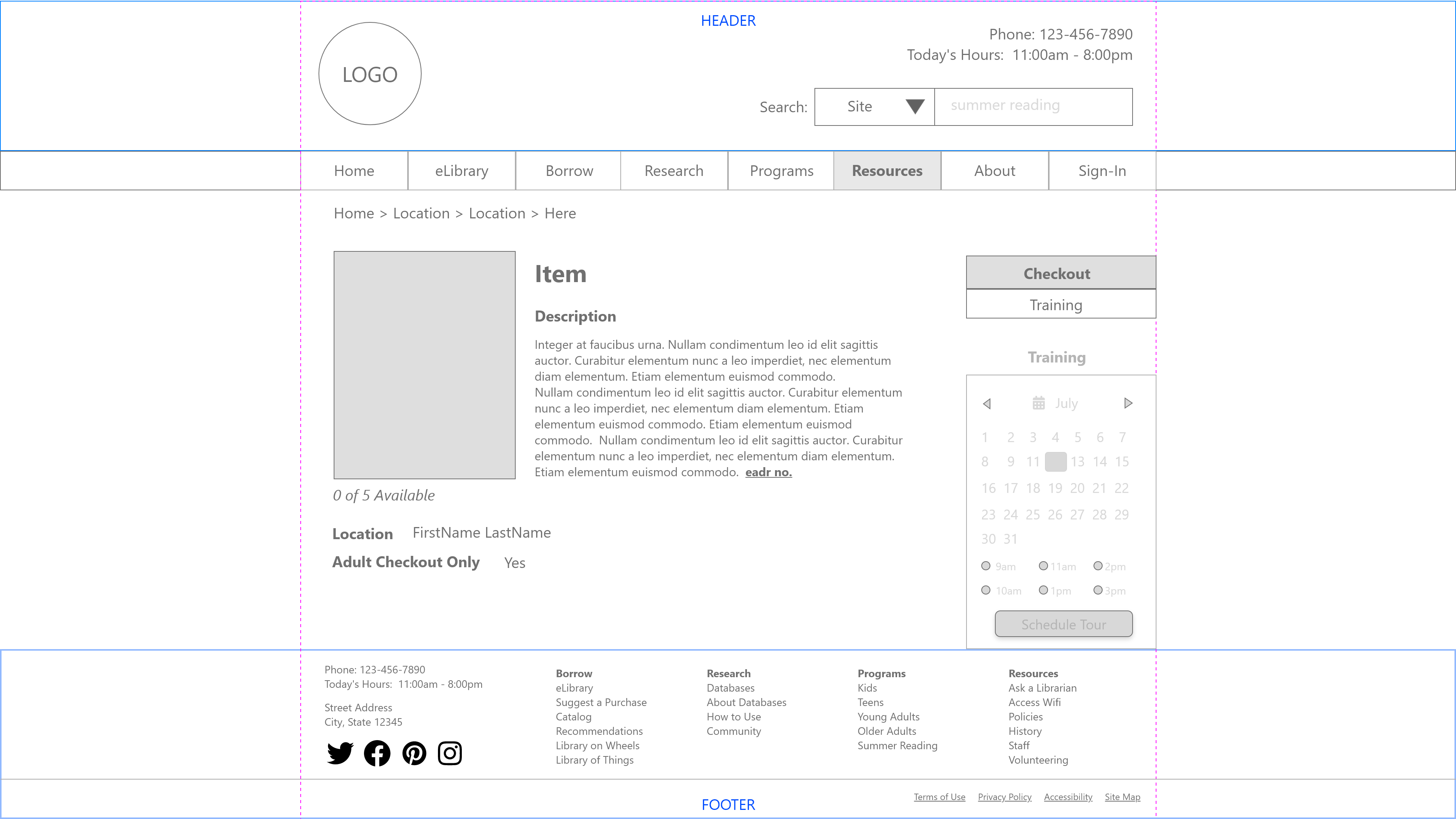
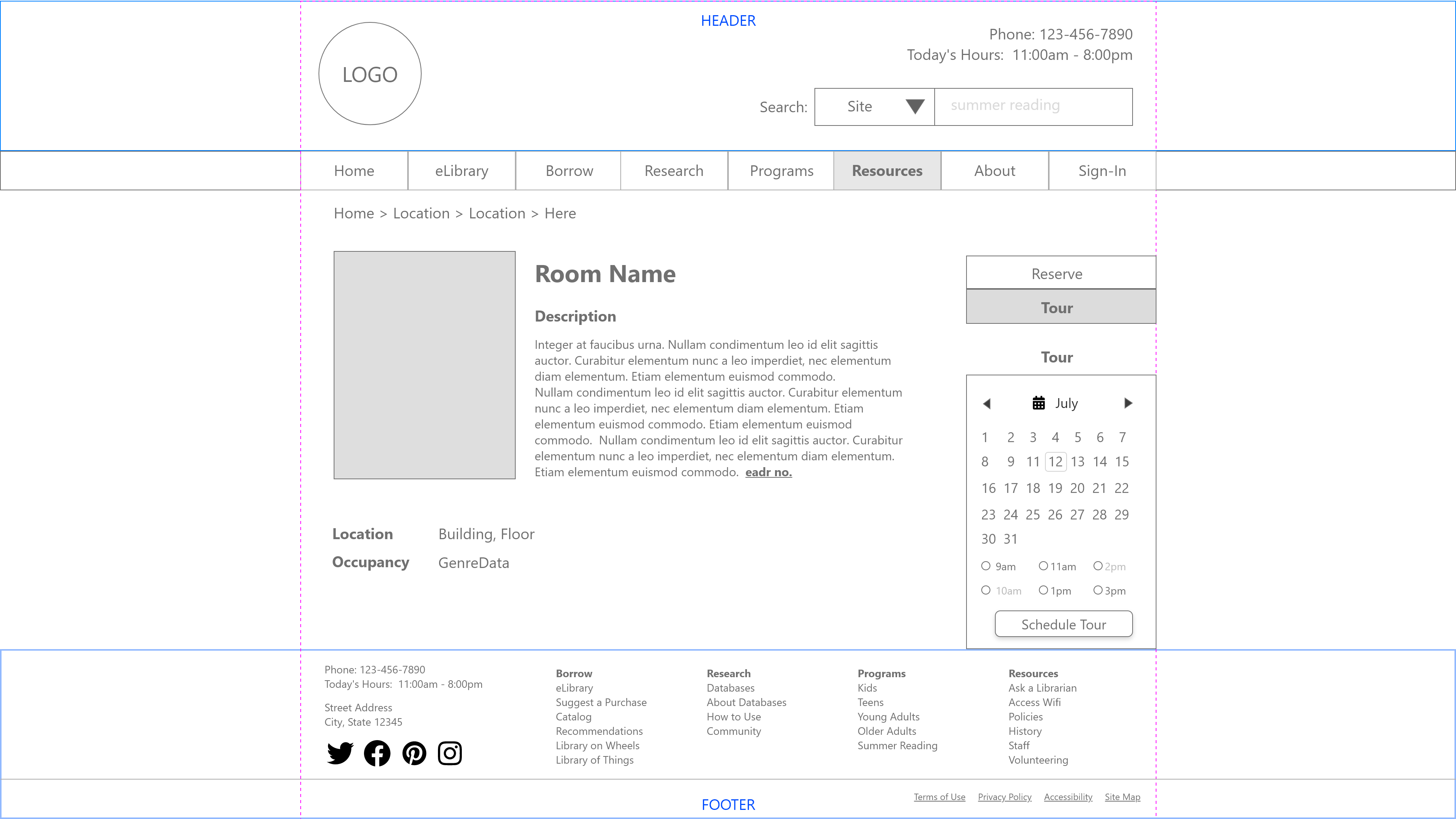
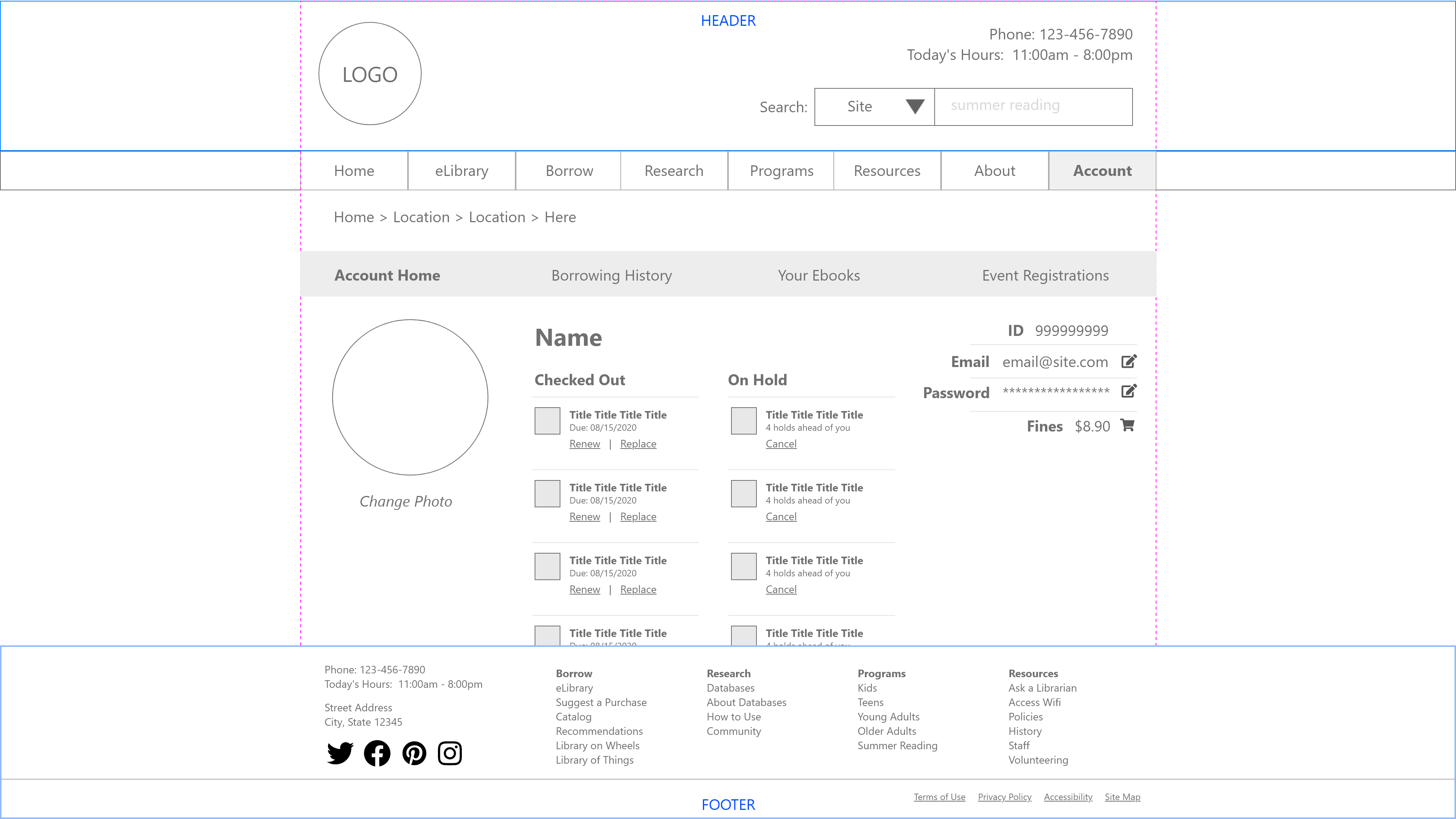
Pay Fines, Find Events, Access Wifi, Access Databases, Borrow Technology – Wireframes for many other critical pages were also created to aid the developer with understanding layout and information needs.
First-Click Testing
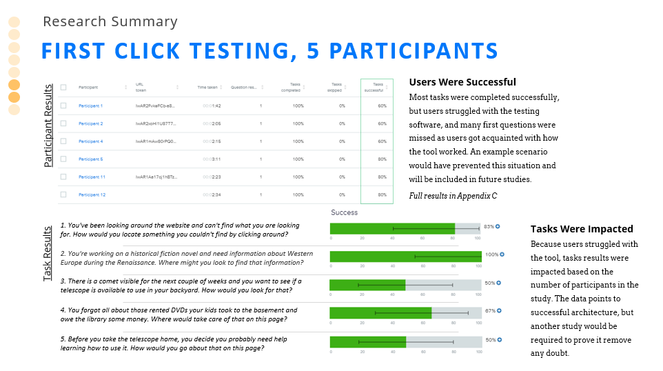
To assess the wireframe efficacy, first click tests were administered to a smaller audience. First click tests give the user one chance to click the right thing. If that one click is correct, then the design correctly communicates the available option to meet the need of the user. If the first click is inaccurate, then the design is “off” and needs revisiting. As you can see, users did well with the tasks administered.
Results
The final deliverable to the client was presented as a slide deck. The wireframes that were created satisfied the needs of the personas, based on the research that was conducted to create them. Testing confirmed that organization, labeling, and navigation worked for users, and that the design should result in a far better user experience.
Lessons Learned
- Looking at this and other library sites, the lack of funding is clearly evident as they are often still relics of dated web-design styles
- Local public libraries are also tasked with more information ownership than just books, often existing as some of all of the local historical archive
- The survey and interview data from patrons and staff often overlapped in convenient ways, but occasionally diverged and left open the potential for two different portals into the information
- Tree testing is a fun and unique way to measure your navigation menus, and is likely done far too infrequently
- First click tests are more complicated and require more upfront training on how the tool works to get accurate results
- Scheme classifications are critical but modern sites often must employ some form of hybrid scheme because of the diversity of information included
