For: Kent State University
Role: Student, UX Lead
When: February 2019
Summary
My first end-to-end UX design project was to focus on a productivity app for to-dos and reminders. The project included user interviews, workflows, wireframes, and an interactive prototype.
Skills
- Workflows
- Wireframes
- Prototypes
- Adobe XD
- Hand-drawn Sketches
- Research Protocol
- In-Person Interviews
- Interview Analysis
- Personas
PROBLEM
In this hypothetical scenario, the founders of ReminderX, a new startup app had decided they want to take their basic to-do list and reminder app to the next level but were not sure what product features or audience to focus on. Not an uncommon problem for eager young entrepreneurs.
The founders requested user research to uncover critical features in tandem with the definition of a representative user persona. The designer is to identify and prioritize features, then develop workflows and wireframes.
APPROACH
User Research
Consent NDA
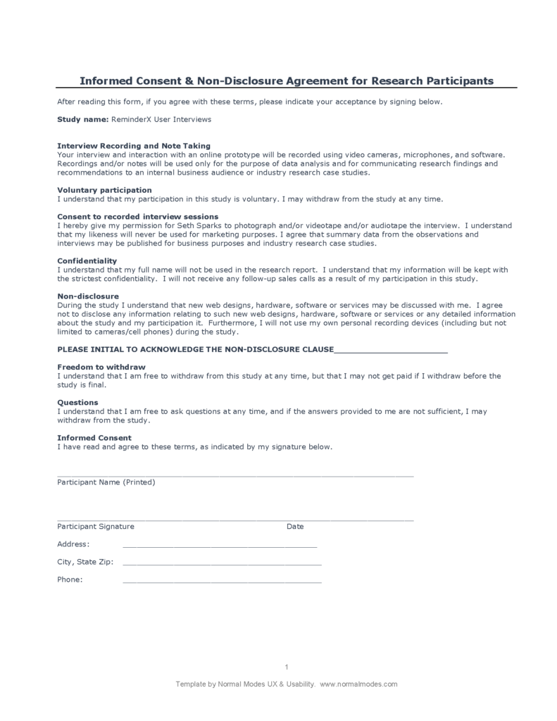
The first step to user research was ensuring participants understood the process and their rights. To confer that information, a consent NDA was provided for physical signature or read aloud prior to the interview to gain a verbal approval.
Research Protocol
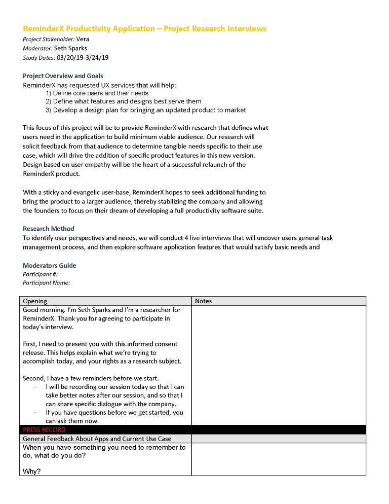
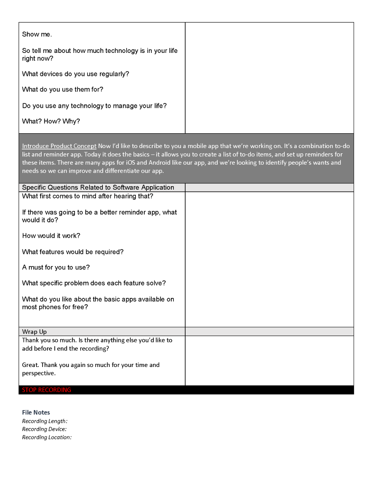
Protocol
A protocol and script sheet were developed to help the interviewer stay on track and capture critical notes for follow-up in real-time.
Interviews
Interviews were conducted with four participants. Each interview was recorded with consent and transcribed for analysis.
Interview Results
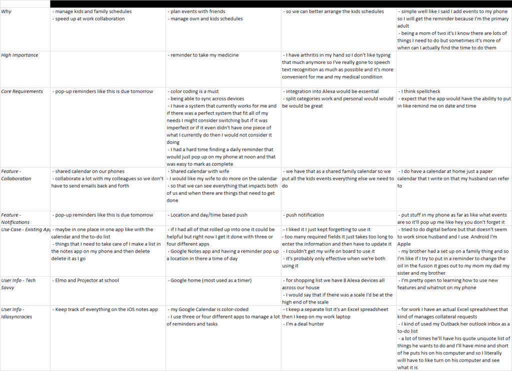
Interview data identified a number of considerations for design:
- Consider the holistic productivity ecosystem
- Product requirements:
- Notifications
- Color code lists and items
- Sync data across devices
- Integrate with voice assistants
- Trigger reminders with location
- Setup recurring reminders
- Collaborate with others
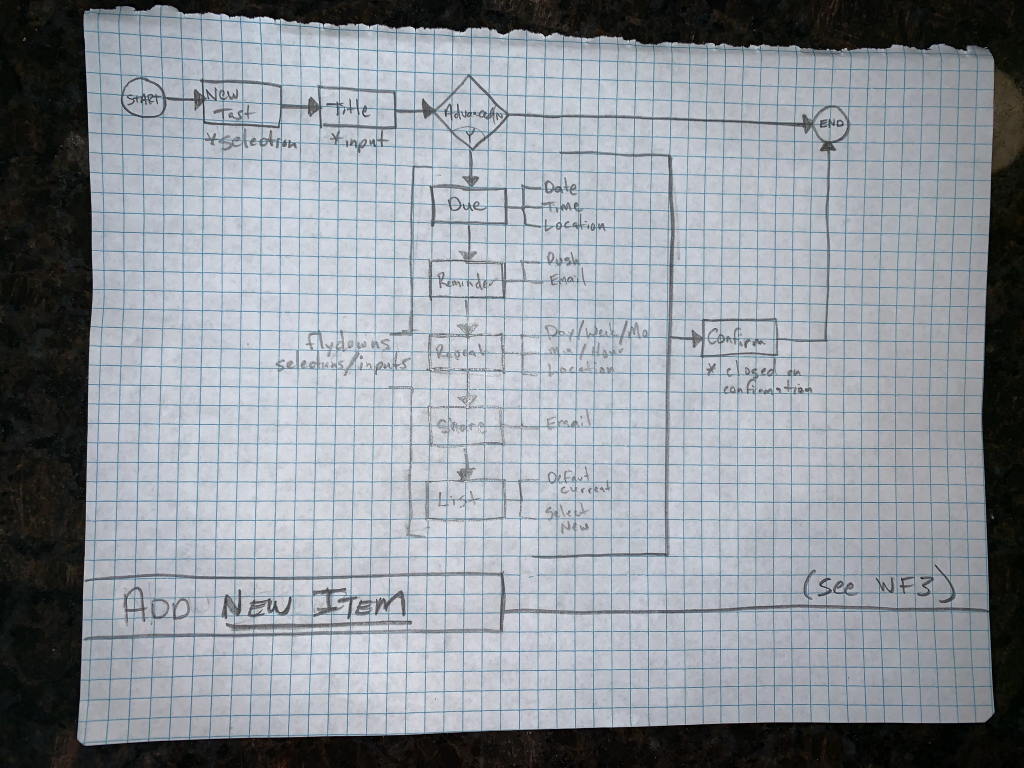
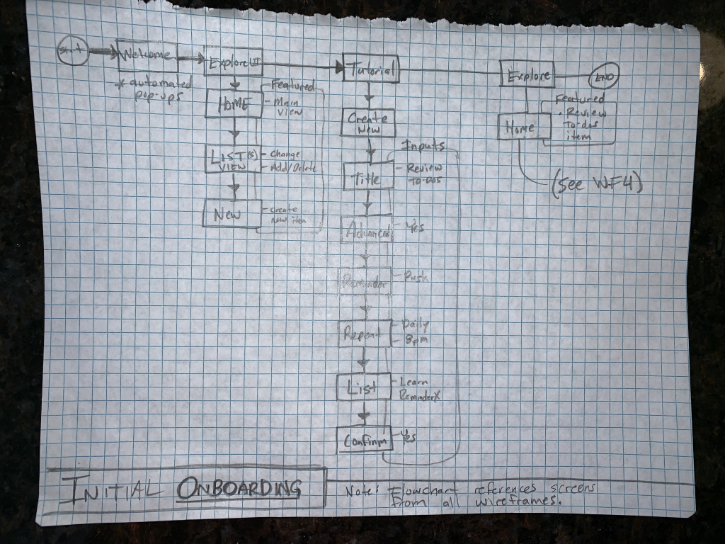
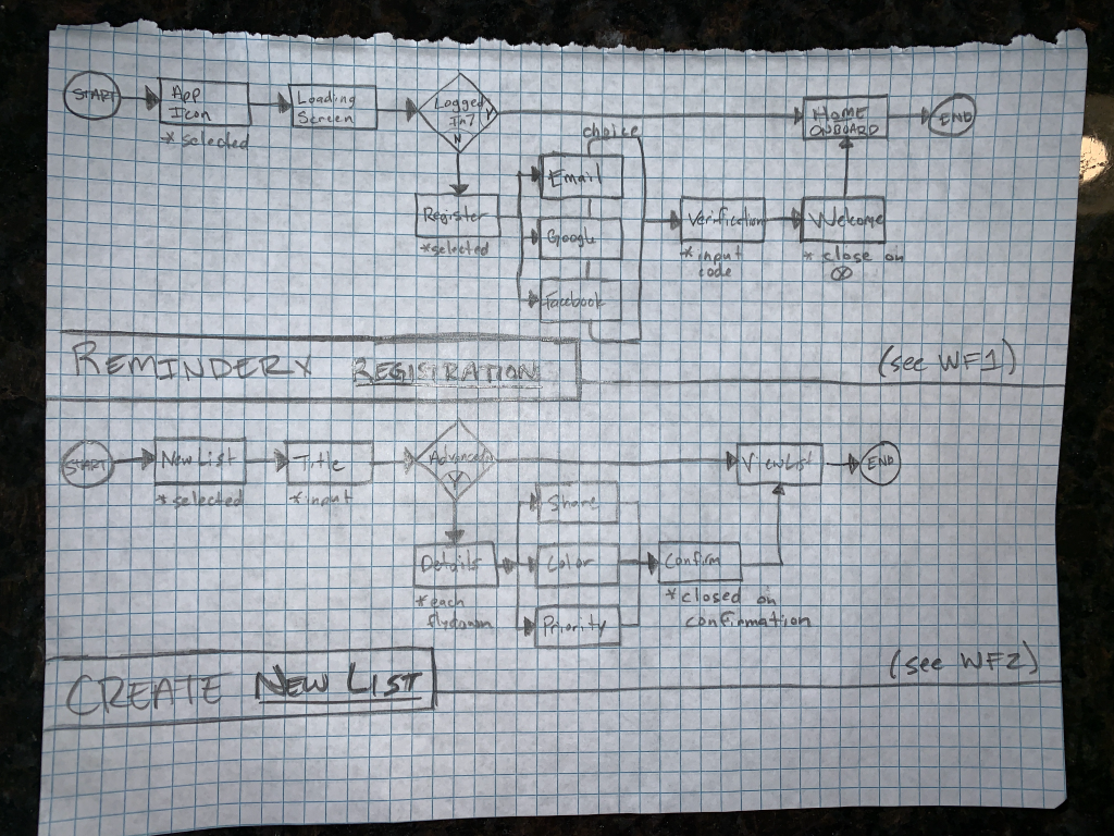
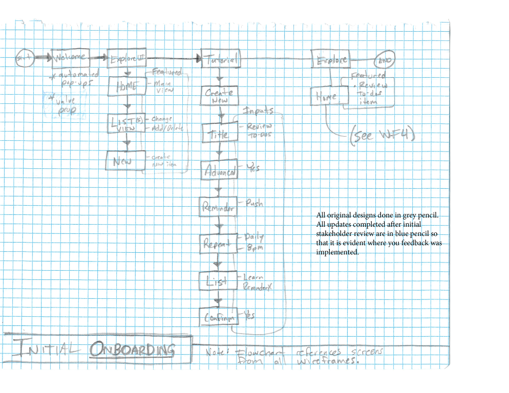
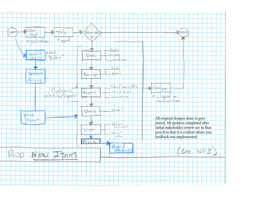
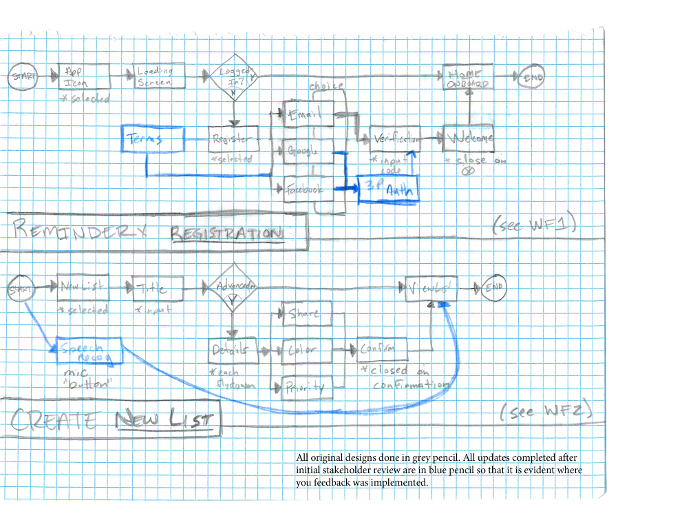
Workflows
Wireframes (Sketch)
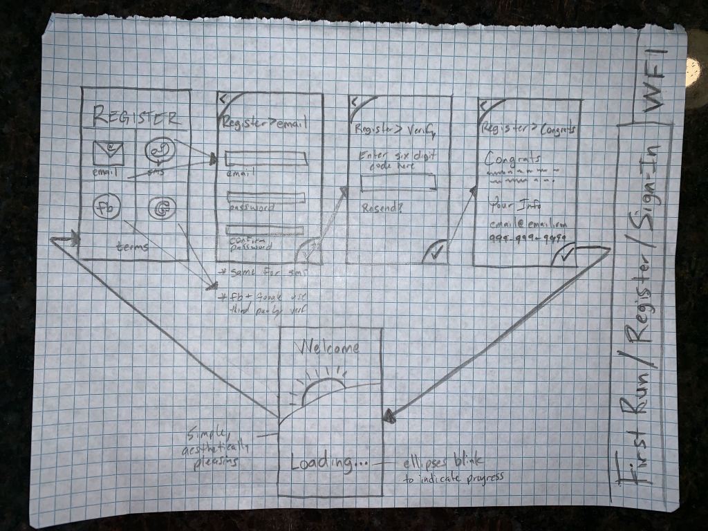
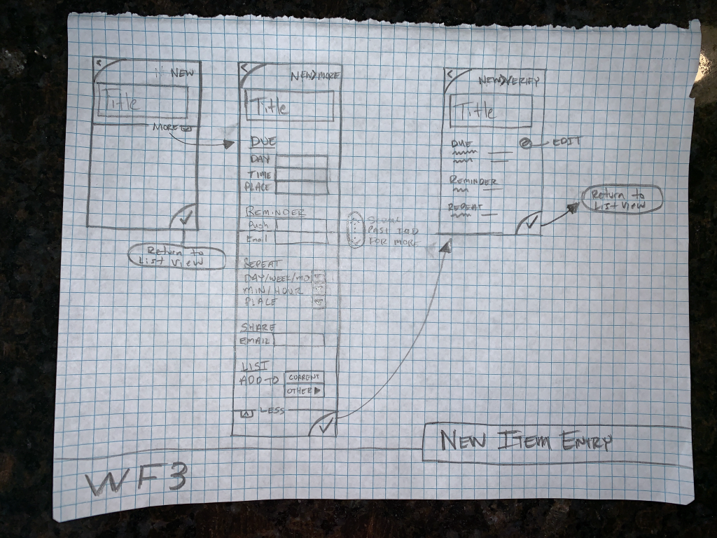
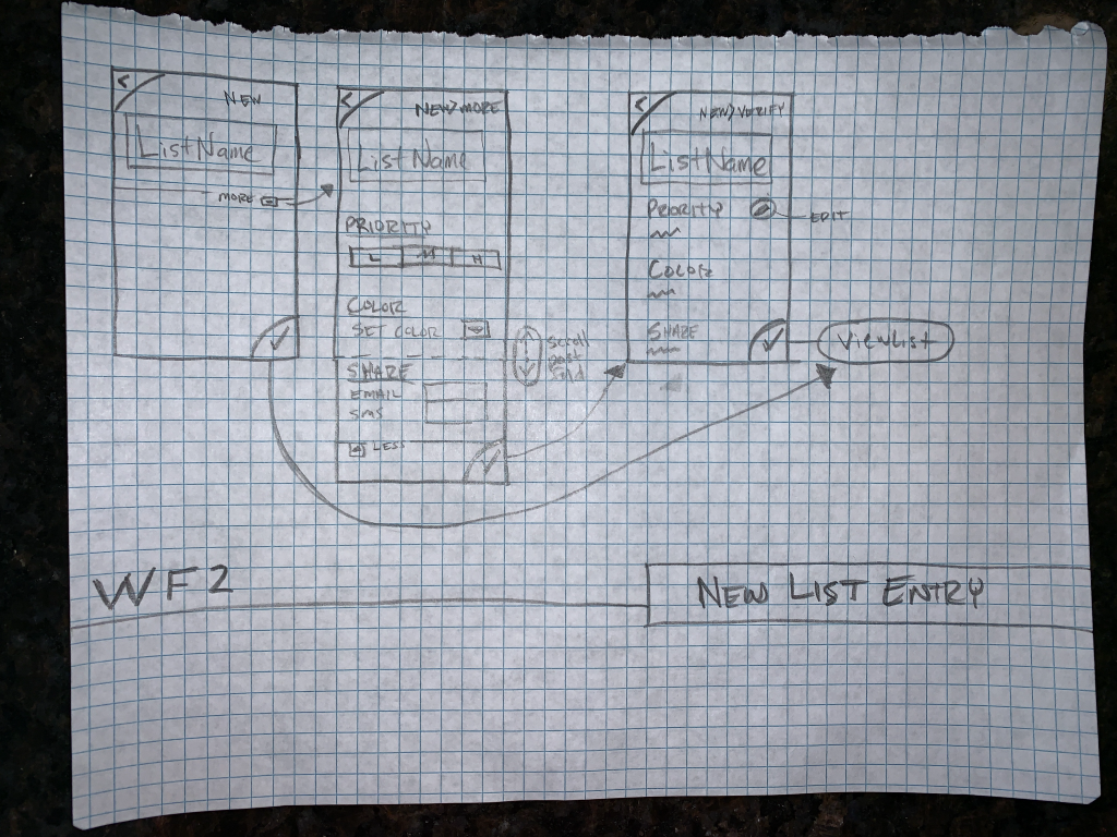
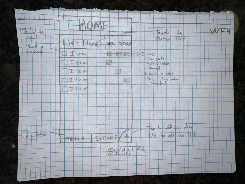
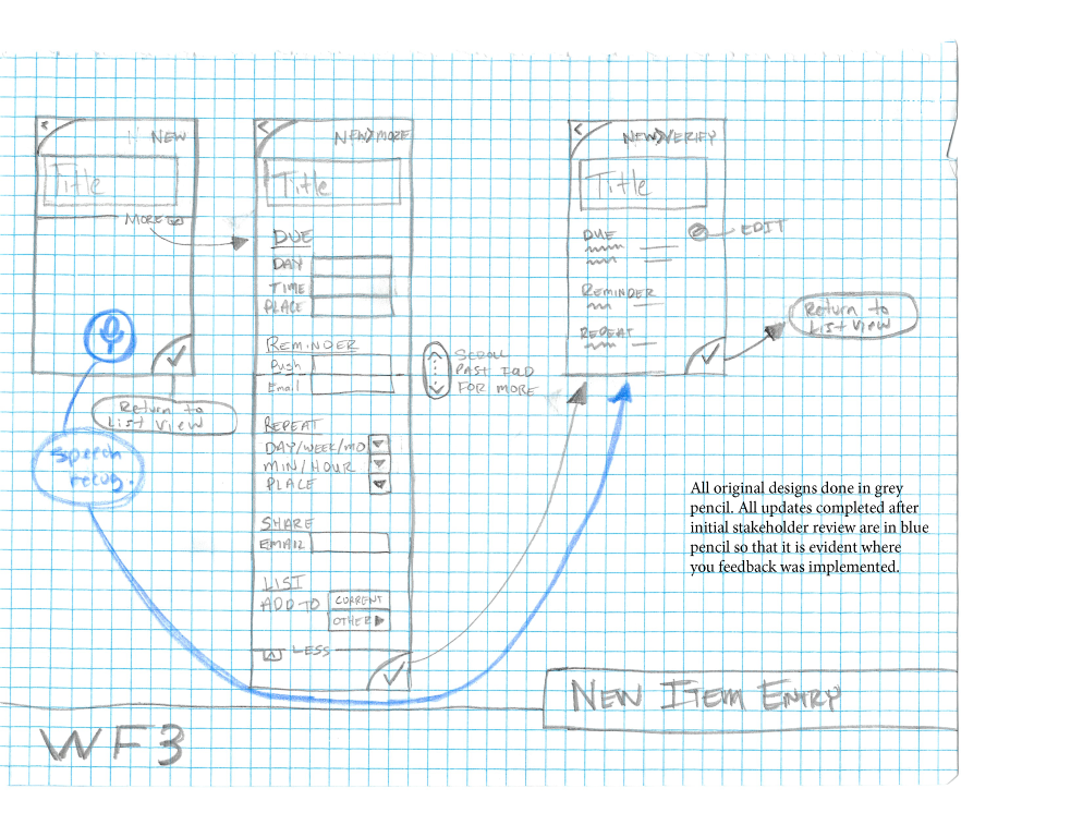
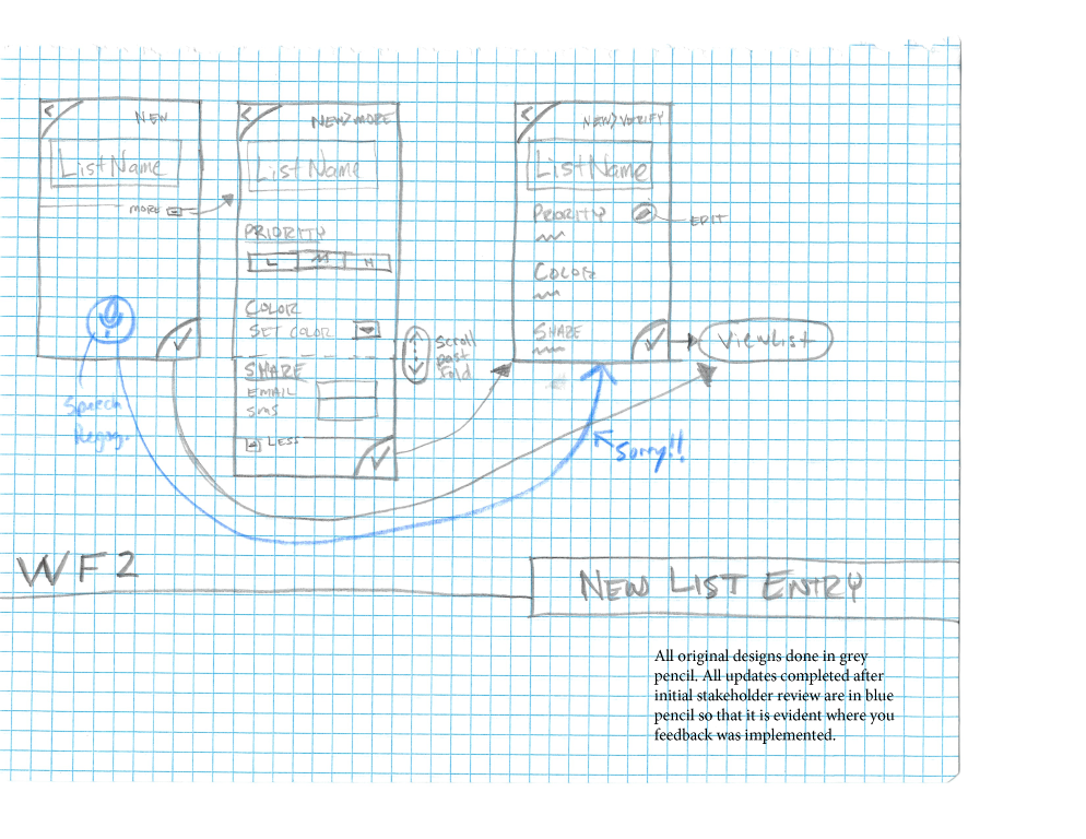
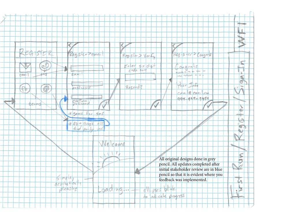
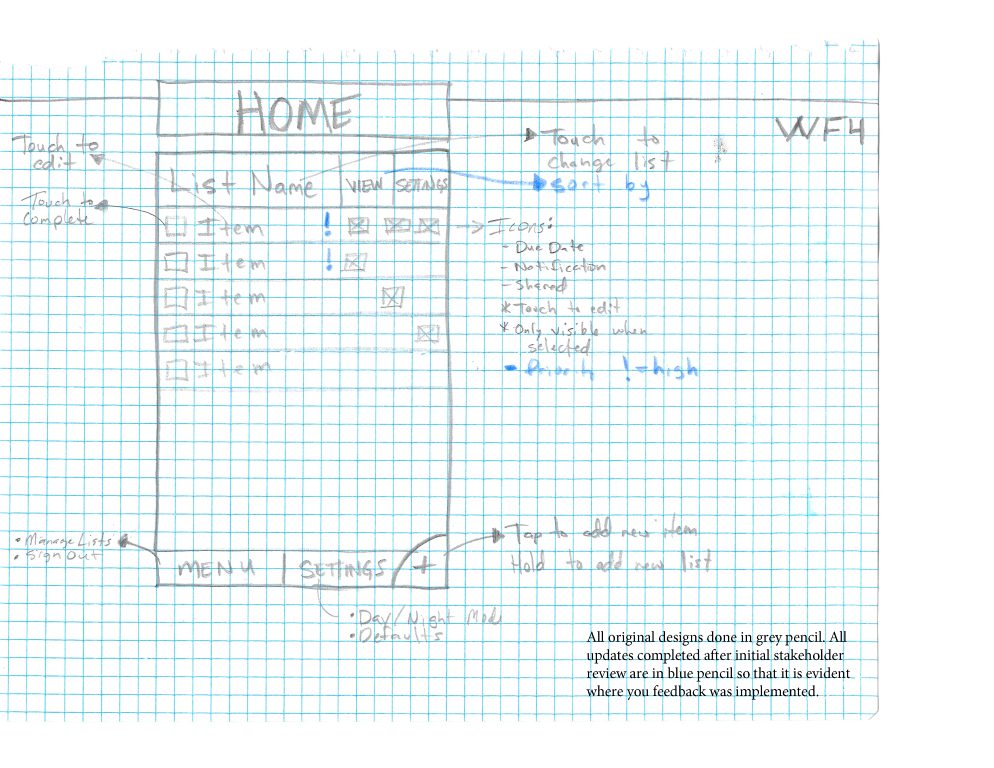
Once workflows were finalized, wireframes for all screens across all flows were drafted by hand. These designs were bundled to show the flow from screen to screen. This low-fi design method made it easy to take back to research participants for review and modification.
The only creative design element that was included on the wireframes were the consistent “back”, “accept”, and “new” rounded buttons in the top-left and bottom-right corners. These were intended to give the app a bit more identity, but also conflict with core OS functionality that others apps follow, contradicting Jacob’s Law.
Wireframes (Digital)
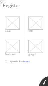
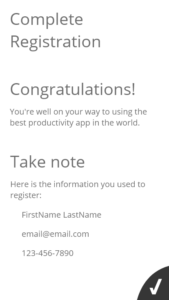
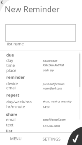
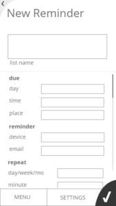
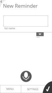
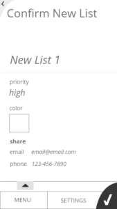
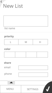
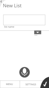
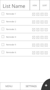
The hand-drawn wireframes were digitized using Adobe XD (my first project in the application). Key features were notated and referenced for developer understanding. The designs were done absent of color, allowing the company to brand it according to their own palette.
Wireframe flows included:
- Registration
- Home Screens
- New Reminder
- New List
- Onboarding
RESULTS
You can view the final interactive prototype for yourself. Looking back at this as my first design, I’m pleased with how much I learned in my first course. This work was prior to taking full courses on research, interaction design, and usability. Refreshing this design with those skills would produce an even more polished product, which I may do eventually.
Lessons Learned
- Allowing users the opportunity to review the information before committing the data is a critical aspect of usability
- Immediate feedback for selections like color are key to help the user understand what the choice will look like and if they want to commit it
- Novice users just expect to be able to enter an item without details, while expert users expect to be able to access advanced features, which requires balancing the application to work for both
- Adobe XD is similar to other Creative Suite apps, as expected, but did have some idiosyncrasies that made watching a tutorial worthwhile
